Robert Shiller가 1996년 7월 작성한 발표자료입니다. "수익률 예측가 인 주식 시장 전망 : 1996 년 증권 시장 전망"이라는 제목의 보고서에서 "시장은 향후 10 년간 가치가 크게 하락할 가능성이 높으며 장기 투자자는 향후 10 년 동안 시장에서 벗어날 것 "이라고 밝혔습니다.
http://www.econ.yale.edu//~shiller/data/peratio.html
이 내용은 CAPE P/E 지수를 제시한 보고서로 보면 됩니다. 발표 당시에 과연 이 지수가 맞는것인지 아닌것인지 확신이 없어서 인지 내용에 대한 로버트 쉴러는 보고서 내용에 대한 설명을 부족하게 한것으로 생각됩니다.

발표당시 1996대비 20년이 지난시점에 이 CAPE p/e 데이터를 사용하는것은 올바른 방법일까요? 로버트 쉴러, 워렌버빗등 투자가의 대가들이 현재 가격은 비싸기 때문에 주식 투자에 주의해야 한다는 의견을 뉴스를 통해 계속적으로 나타내고 있습니다.
'버핏 지표 (Buffett Indicator)'에 따르면 주가가 닷컴 버블 (Dot-Com Bubble)이나 그레이트 불황 이전보다 훨씬 과대 평가되고있는 것으로 나타났다.
9 년이 넘는 강세장에서 상승세를 보였던 일부 투자자들은 미국 주식의 비중이 얼마나 높은지에 대해 우려하고 있습니다. 월 스트리트 전문가와 버크셔 해서웨이 (Berkshire Hathaway Inc.) (NYSE : BRK-A) (NYSE : BRK-B)의 워렌 버핏 (Warren Buffett) CEO가 선호하는 재무 메트릭스에 따르면 투자자는 우려 할 만하다.
사실, 버핏이 한때 메트릭을 "주어진 순간에 밸류에이션이 어디에 위치하는지에 대한 최상의 단일 척도"라고 부른 후에, 투자자들은이 계산을 "버핏 지표"라고 부르기 시작했다.
버핏 지표 란 무엇입니까?
버핏 지표는 미국 주식 시장의 시가 총액을 미국 GDP로 나눈 값입니다. 투자자는 미국 시장의 가치를 평가하기 위해 다양한 변종을 사용할 수 있지만 현재 모두 일부 신호가 깜박 거리고 있습니다. 아래 차트는 닷컴 버블 붕괴와 2008 년의 경기 침체 이전에 버핏 지표가 최고조에 달했던 부분을 보여줍니다.

시가 총액 기준으로 Wilshire 5000을 사용하면 Buffett 지표는 현재 138 %를 상회하고 있습니다. 금융 위기 이전의 주택 시장 버블 동안 버핏 지표는 105.2 %에 그쳤다. 닷컴 버블 동안, 그것은 단지 136.9 퍼센트를 정점에 도달했다. 버펫 지표는 지난 반세기 동안 다른 어떤 시점에서도 100 %에 접근하지 못했습니다.
무슨 뜻이에요?
버핏 자신은 최근 미국 경제에 대한 단기 전망에 대해 낙관적 인 견해를 표명했지만 버핏 (Buffett) 지표와 다른 많은 지표들은 주식이 역사적으로 비싸다고 제안했다. 물론 금리가 여전히 역사적으로 낮은 수준에 머물러 있어도 투자자들은 여전히 시장에 대한 대안을 거의 가지고 있지 않습니다.
버핏 지표는 또한 예측할 수있는 가치가 제한되어 있으며 비싼 주가가 역사와 얼마나 비 교적인지를 단순히 반영합니다. 금융 거품 전문가이자 노벨 수상자 인 로버트 실러 (Robert Shiller)는 거품을 찾아 내고 언제 나타날지 결정하는 것은 완전히 다른 두 가지 업적이라고 말한다.
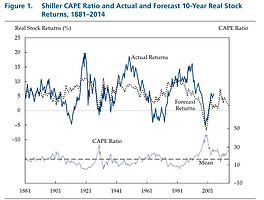
작년 Shiller는 주기적으로 조정 된 가격 대비 수익 (CAPE) 비율을 재고가 역사적으로 비싸다는 것을 나타내는 또 다른 장기적인 가치 척도로 언급했지만, 투자자는 가까운 장래에.
"우리는 시장에 정확하게 시간을 할애 할 수는 없지만, 장기적으로 볼 때 이것이 높으면 보통 대단하지 않습니다."
케이프 우려
Shiller의 발언 당시 S & P 500 CAPE는 28.6에 가까웠는데 역사적 평균 인 16.8보다 훨씬 높았으며 1999 년 닷컴 거품이 최고조에 달했던 44.1을 기록한 이후 최고치를 기록했다. S & P 500 CAPE는 33.1로 확대 된 이후 대공황 이전의 최고 수준조차 초과했습니다.
주식 시장은 2018 년까지 지금까지 둔화 조짐을 보이지 않고있다. SPDR S & P 500 ETF 트러스트 스파이 0.55 %는 6.6 년 전까지 상승했다.
The 'Buffett Indicator' Says Stocks Are More Overvalued Now Than Before Dot-Com Bubble Or Great Recession
after more than nine years of mostly uninterrupted bull market gains, some investors are getting understandably concerned about just how expensive U.S. stocks have gotten. According to financial metric that is a favorite of Wall Street guru and Berkshire Hathaway Inc. (NYSE: BRK-A) (NYSE: BRK-B) CEO Warren Buffett, investors are right to be concerned.
In fact, after Buffett once called the metric “the best single measure of where valuations stand at any given moment,” investors have begun referring to the calculation as the “Buffett indicator.”
What Is The Buffett Indicator?
The Buffett indicator is a relatively straightforward calculation: it’s the total market cap of the U.S. stock market divided by U.S. GDP. Investors can use different variants to estimate the value of the U.S. market, but all of them are flashing some disturbing signals at the moment. The chart below highlights where the Buffett indicator peaked prior to the bursting of the dot-com bubble and the 2008 Great Recession.
Using the Wilshire 5000 as the market cap benchmark, the Buffett indicator is currently sitting at above 138 percent. During the housing market bubble prior to the financial crisis, the Buffett indicator peaked at just 105.2 percent. During the dot-com bubble, it peaked at just 136.9 percent. The Buffett indicator hasn't approached 100 percent at any other time in the last half century.
What Does It Mean?
Buffett himself has recently expressed his trademark optimism about the near-term outlook for the U.S. economy, but the Buffett indicator and a number of other metrics suggest stocks are historically expensive. Of course, with interest rates still near historically low levels, investors still have few viable alternatives to the market, a phenomenon that has helped drive the market rally.
The Buffett indicator also has limited predictable value and is simply a reflection of how expensive stocks are relative to history. Financial bubble expert and Nobel laureate Robert Shiller says identifying a bubble and determining when it's going to pop are two entirely different feats.
Last year, Shiller referenced the cyclically-adjusted price-to-earnings (CAPE) ratio as another long-term value metric that indicates stocks are historically expensive, but he warned investors not to make assumptions about what that may or may not mean in the near-term.
“We can't time the market accurately, but we know that when it's this high, over the long term, it usually doesn't do great,” Shiller said.
CAPE Concerns
At the time of Shiller’s comments, the S&P 500 CAPE was at around 28.6, well above its historical mean of 16.8 and at its highest level since it peaked at 44.1 during the height of the dot-com bubble in 1999. The S&P 500 CAPE has since expanded to 33.1, exceeding even its peak level prior to the Great Depression.
The stock market has so far shown no signs of slowing down in 2018. The SPDR S&P 500 ETF Trust SPY 0.55% is up another 6.6 year-to-date.
'재테크' 카테고리의 다른 글
| 어드바이저 NH로보 글로벌ETF자문형 (0) | 2018.08.19 |
|---|---|
| KODEX 은행 ETF 배당금(분배금 및 보유종목 Top10) (0) | 2018.08.17 |
| 로버트 쉴러의 CAPE Ratio에 대한 새로운 시각 (0) | 2018.08.13 |
| 로또 3개 맞아서 5등 당첨 (0) | 2018.08.12 |
| Joseph Palmer & Sons 투자위원회 CAPE 지수 고민 (0) | 2018.08.11 |